SAP
SERVICE CLOUD
Target Users
Customer Service Team
Company
SAP
Platform
Desktop
User Size
Not Publicly Disclosed
BACKGROUND
SAP Service Cloud was originally part of the SAP Cloud for Customer (C4C) product. Following a reorganization in 2018, it was separated from C4C and merged with Coresystems, a newly acquired Field Service Management (FSM) company. As a result, the entire Service Cloud team was restructured and integrated with the Coresystems team, forming a new, independent unit apart from the original C4C organization.
WORKSHOP IN WALLDORF
To align on the blueprint and future direction of SAP Service Cloud, all Product Managers, Product Owners, Designers, and User Assistance colleagues gathered at SAP headquarters in Walldorf for a week-long workshop. Our global Design team—spanning Germany, China, the United States, India, and Switzerland—collaborated closely throughout the sessions, which were hosted by our design manager.
CUSTOMER VISITING
Our design manager traveled from Palo Alto to Chengdu and led our two designers on-site visits to two customer call center departments, one is Chengdu Airlines. We observed their working environments and operational procedures, and conducted interviews with several call center agents and their managers.
What I observed...
Work Environment
There are a total of around 30 agents, distributed across 3 rooms, with 12 agents per room. Each agent is assigned an individual booth, equipped with a computer, a headset, a telephone and several reference handbooks to assist during the call.
Handbooks
Each agent has a handbook provided by the company, containing scripts and answers to various questions. The pages have colorful tabs along the edges, each tab has different words on it. They also write notes on the handbook for their own references.
Channels
Agents usually use their secondary WeChat account and phone call to contact with customers. And they switch between many different softwares on their computer during the call.
Manager
The manager doesn't sit together with agents, she has her own office. And she will record each agent's behavior, like their First Call Resolution rate, Average Handling Time and Customer Satisfaction Score and so on.
Then I talked with an agent...
Q: Why do you use two WeChat accounts?
A: Because we don’t want our personal WeChat accounts to be banned. We handle a large volume of customer inquiries for business purposes every day, which goes against WeChat’s policies. If detected, the account gets banned—this is already my third one.
Q: What are the notes on your handbook?
A: These are the updates to the handbook, which happen regularly. The company doesn’t reprint the entire handbook for each update, so we need to handwrite the updated sections ourselves.
Q: What softwares do you usually use on your computer?
A: I use the CRM system, WeChat, and Excel. The CRM system is primarily for recording the issues, while WeChat is used for texting customers. Excel serves as our knowledge base, where we search for the right solutions.
Q: Are you satified with the current workflow?
A: I'm already used to it since we were trained this way. But I do think it could be improved—if we could handle everything in one place, that would be fantastic.
Persona
Use Case
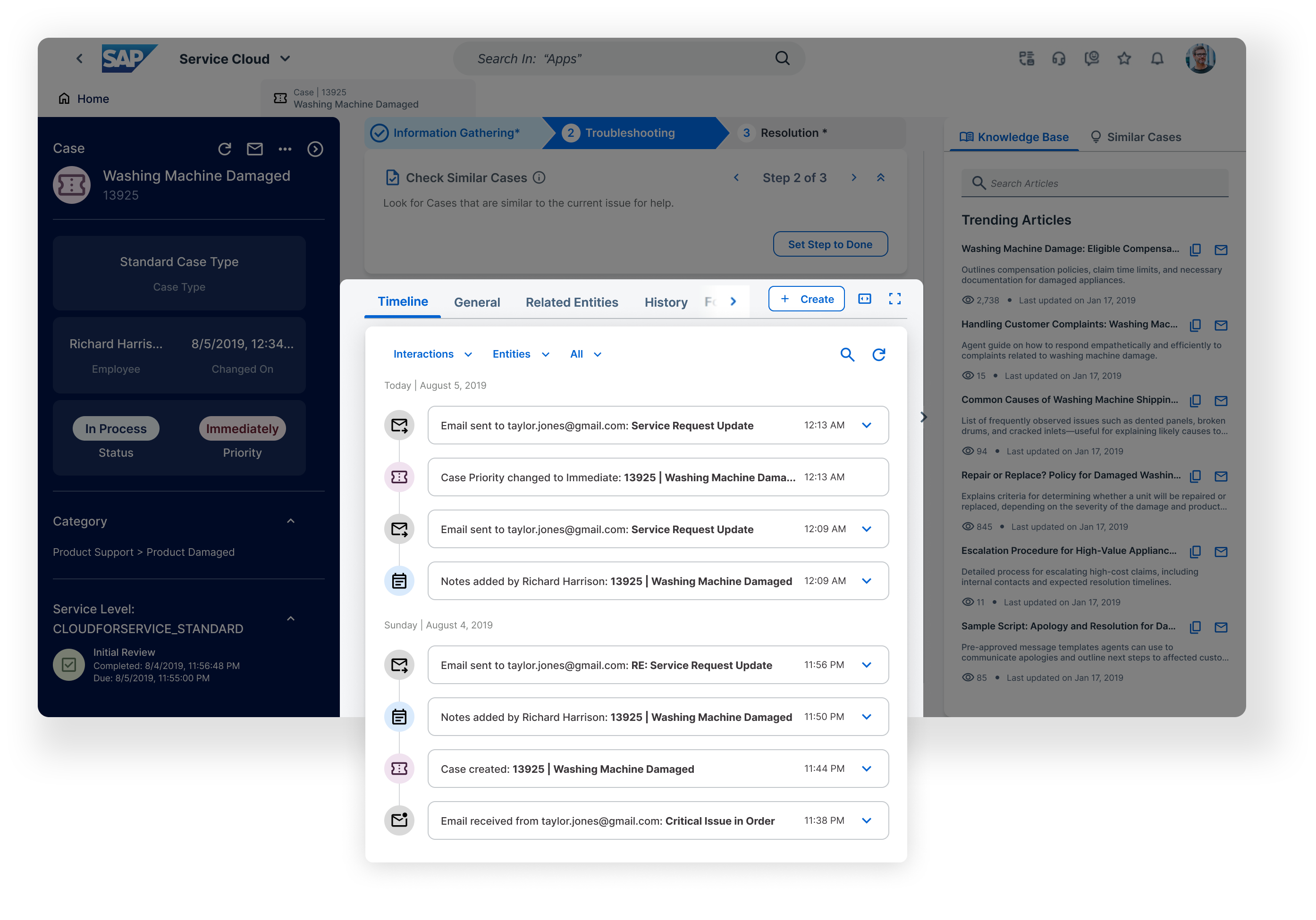
I was responsible for the Knowledge Base section design
- The Knowledge Base should be readily accessible at all times, ideally docked or as a collapsible side panel.

- Accessing it must not disrupt the current call or case view, context should be preserved.

- Agents should be able to search, view, and copy content from the Knowledge Base without losing sight of caller history or ongoing interactions.
Framework
The central design team in Germany is responsible for the overall framework and architecture of the system. The Product Owner, Design Manager and I held several meetings with them and reached an agreement to incorporate a side panel into the framework. This allows users to expand or collapse the panel on the right side at any time, ensuring quick access without disrupting their current workflow.
Search results
In my previous design, the search list would refresh every time the user typed in the search field. This created a heavy load on the backend server due to the high frequency of queries.

To address this, the Product Owner and I decided to trigger the query only when the user stopped typing for 2 seconds or pressed Enter. However, this introduced a sense of lag and made the system feel less responsive.

Meanwhile, internal users also reported that the search result list looked too similar to the default view with no search input. To solve both issues, I proposed the following idea.
The new design clearly distinguishes between search results and the default trending articles list by introducing a breadcrumb and a message like “X results found for [keyword].” This not only improves clarity for users but also resolves the query performance issue—search queries are now triggered only when the user presses the Enter key. Additionally, users can continue refining their search directly from the results page or return to the default article list by clicking the breadcrumb.
Article page
The previous version of the article page featured only a back button at the top, maintaining a clean and simple layout. However, internal users reported that it was inconvenient to navigate back just to enter new keywords or search for related cases.

Another key piece of feedback was that users didn’t want to rely solely on keyword search—they also preferred browsing by path, which helps them discover related articles that might not contain the exact keywords.
The refined version effectively addressed the issues. Tabs are now fixed at the top, allowing users to switch seamlessly between the Knowledge Base and Similar Cases at any time. The search area displays the current keywords and lets users enter new ones without navigating away. A breadcrumb trail shows the article’s location within the folder structure, enabling users to trace back to its source. Additionally, the original “Back” button was renamed to “Return to Search” to clearly distinguish it from the breadcrumb navigation.
I was also responsible for part of the Timeline section design
The timeline allows users to quickly grasp the overall process and dive into specific details when needed.

Therefore, it should occupy the main area of the case or customer detail pages, clearly displaying event types and their contents in chronological order.

Time stamps must be shown for each entry, making the timeline the central hub for tracking the entire process related to a case or customer.
Variant Types
Nearly twenty different types of events are arranged chronologically, each with its own unique set of information. The timeline captures the complete interaction lifecycle of a case or customer, making it easy for users to review the history and also providing valuable context for taking further actions.
Design System
Success Metrics
Both the Knowledge Base and Timeline features were well received by team members and design managers. They have since been delivered globally as key functionalities of our standard product, reflecting their value and impact on customer experience.
Shuai Design
2025@Shuai Zhou. All Rights Reserved